

- Plan ItBack
- Design ItBack
- Build ItBack
- Homes
- ProductsBack
- CostsBack
- Self Build Cost Calculator
Estimate your project costs instantly with Build It's interactive self-build cost calculator
Calculate Now - Costs & Finance
- Contracts & Warranties
- Build It Estimating Service
Get an accurate, detailed cost breakdown of your project
Submit plans
- EventsBack


 Login/register to save Article for later
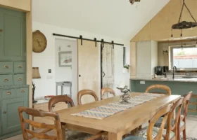
Home Decorating Ideas: Choosing Paint Colours

After the hard graft of building your house – or completing the major works on a renovation project – decorating the interior should be, by comparison, a delight.
And one of the best decorating jobs is painting the walls. Not only can you transform a room in a relatively short space of time, but gliding a paintbrush or roller up and down for a few hours can be positively therapeutic.
It is still possible to get it wrong, however: a colour that seems to-die-for in the tin can look, well, frankly hideous when you apply it to several metres of wall. There’s an art and a science to choosing the right shades: follow a few basic rules, though, and you can achieve a truly professional finish.
What is colour theory?
When it comes to choosing colours for your home, it’s worth getting to grips with colour theory, which is where the colour wheel comes in. It’s a circle divided into segments showing primary, secondary and tertiary colours.
We’re all familiar with the primary colours red, blue and yellow, and the secondary colours, made by mixing equal amounts of primary colours – purple, green and orange. Tertiary colours are made by mixing a primary colour with a secondary colour in a ratio of 2:1 – red-orange, blue-green and so on.
And it’s these mixes of colours, often with a good proportion of white added, that form the basis of decorating colours.
What colours should I use for decorating?
Colours on one side of the colour wheel are ‘warm’ – the oranges, yellows and reds – while those on the opposite side are ‘cool’ – the blues and purples. Neutrals such as black, grey, white and some shades of brown and beige don’t appear on the colour wheel.
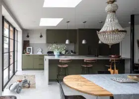
‘Toning colours’ are dark and light shades of the same colour on the wheel. In a decorating scheme you could, for example, use the darkest shade of a single colour on skirting boards and the lightest shade for walls.
Pick up a few ‘stripe’ colour cards, such as the Dulux range, from your local DIY store, and you’ll see they run from dark to light shades of the same colour.
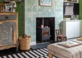
Harmonious colours sit next to, or very close to, each other on the colour wheel, for example reds and burnt oranges. Complementary or contrasting colours sit opposite each other on the colour wheel, for example red and green or turquoise and orange.
You may not want to use bright red and green paint on walls next to each other, but you could opt for tones of the two shades (green and pink) with fabrics in red and green, for example. These splashes of bold colour are your ‘accent colours’.
How to alter perspective with colours
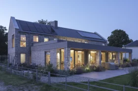
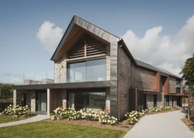
If you’ve built your own home then all the room proportions will be perfect with all the spaces planned to make the most of the natural light.
But if you’re renovating and have a room with poor light, or perhaps a ceiling height that seems out of proportion to the room’s size, you can use paint colours to disguise these defects.
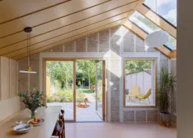
Pale colours, because they contain a lot of white, reflect light and seem to recede, while dark colours absorb light and seem to advance. Paint a room in a pale colour and it will make the room seem larger. Paint a too-high-ceiling in a darker colour and it will appear lower.
An ultra-light reflecting paint such as Dulux’s Light and Space range of rich matt emulsions use LumiTec technology to reflect up to twice as much light around the room. In 30 different colours, it costs £12.99 for 2.5 litres of white and £17.99 for 2.5 litres of coloured paint.
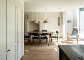
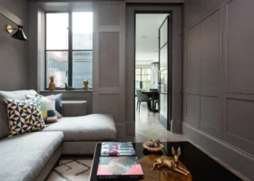
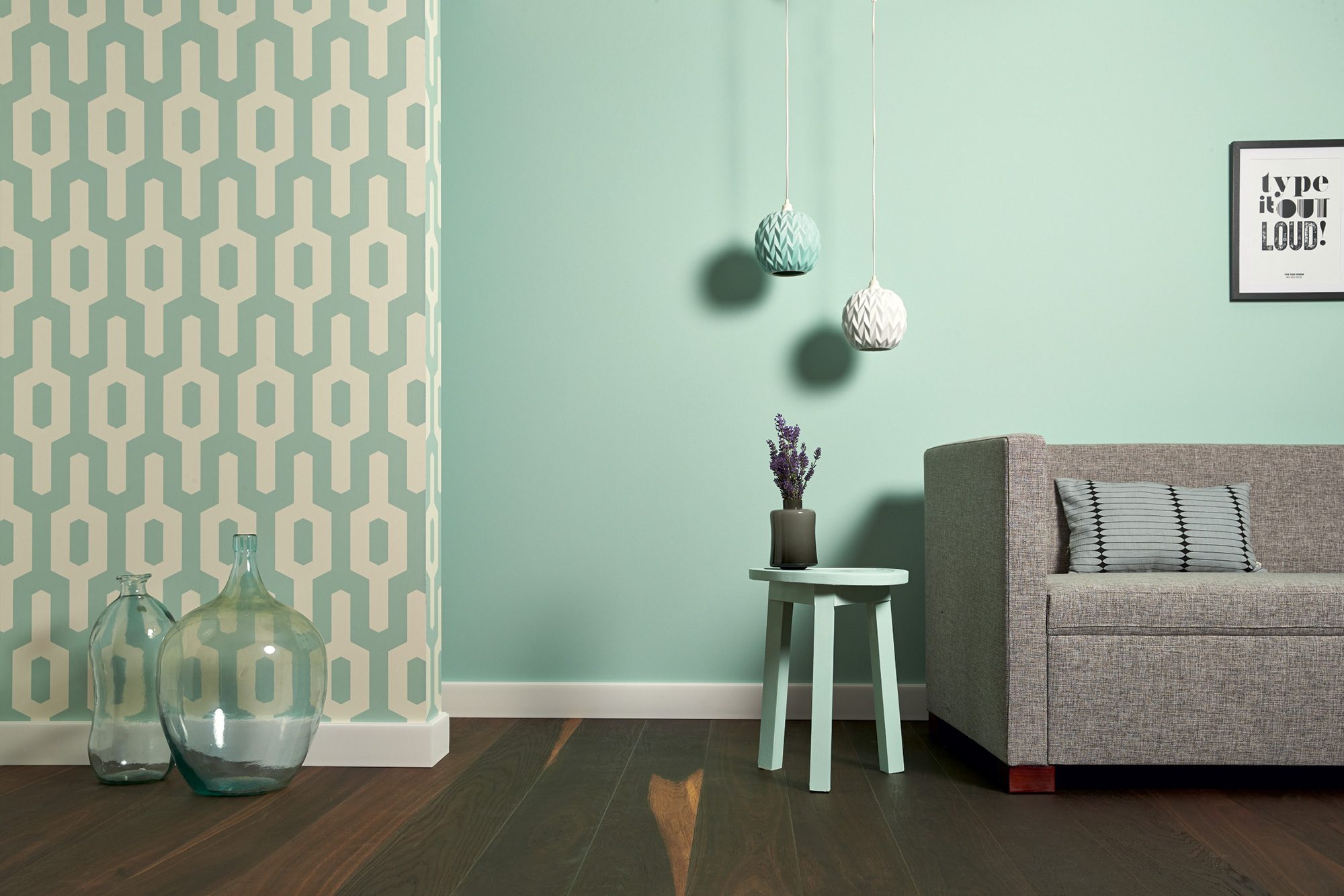
How to decorate with neutral colours
Whatever the style or period of a house, if the walls are painted neutral they are easy on the eye. It is still possible to create a neutral colour scheme that clashes; it’s all down to the ‘hue’ or ‘tone’ of the paint. Neutrals can have a yellow, pink or blue ‘hue’.
White reflects light and can make rooms appear bigger and brighter. On the other hand, it can appear cold and grey if a room is north or east-facing and doesn’t get a lot of direct sunlight. And as brilliant white is a 20th-century invention, it’s not the best choice for period homes.
Off-whites can have a pink, yellow or blue-grey hue – those with a yellowish hue are best in rooms with poor light. Various shades of cream, beige, stone and sand are all popular neutral colours.
Pale greys are fashionable at the moment but they can change drastically with the light. Black is actually a neutral because it will go with nearly any other colour – though it’s probably not recommended if you’re home staging.

You may be interested in


Comments are closed.