

- Plan ItBack
- Design ItBack
- Build ItBack
- Homes
- ProductsBack
- CostsBack
- Self Build Cost Calculator
Estimate your project costs instantly with Build It's interactive self-build cost calculator
Calculate Now - Costs & Finance
- Contracts & Warranties
- Build It Estimating Service
Get an accurate, detailed cost breakdown of your project
Submit plans
- EventsBack


 Login/register to save Article for later
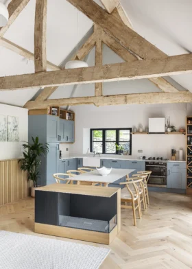
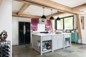
How to Find the Perfect Kitchen
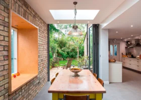
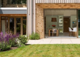
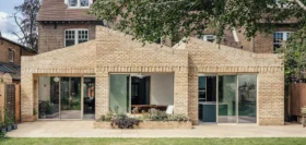
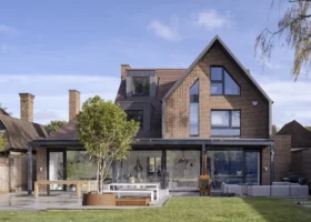
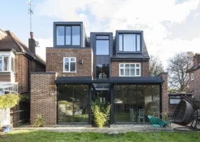
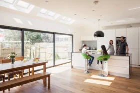
The kitchen is the heart and hub of most homes these days. People are gradually moving away from separate dining rooms and looking to use their space in a less formal way, combining kitchen with an eating area and sometimes, if there is enough room, a ‘soft’ living or family space as well. Whereas kitchens were traditionally small and tucked away, they have now become showpieces – and with that has come the desire for great design.
As a designer, one of the most interesting things about this phenomenon is the combination of style, where people are looking for a particular look or the latest new materials, with the absolute need for function. While kitchens have evolved to encompass dining and living areas, the basic requirement for an organised and ergonomic place for food preparation is still paramount.
Style and substance
When planning a kitchen there are a few common pitfalls, the biggest becoming seduced by the style of a kitchen too early. Design is an evolutionary process, and it is vital to get the fundamentals in place before gradually evolving the details, bringing in the question of style choice relatively late in the game. The reason for this is that there is simply far too much to consider all at once: it is easy to get completely bogged down with cosmetics, which can deflect your focus on the really important basics.
My particular bug-bear is the so-called ‘free’ design service offered by many kitchen design showrooms. The notion that these are free is ridiculous: the cost of the designer is built in to the price that you will pay for the kitchen itself, and to ensure that you can’t abuse this service, many showrooms will not allow you to take away the design until you have signed up for the kitchen. The designer in such instances is essentially a salesperson whose remit is less about giving you the most appropriate design, and more about how many expensive components they can include within your scheme.
Very often, showroom-based designers will focus just on the kitchen itself and not take sufficient account of how the kitchen will relate and connect with the other spaces around it. Had you considered knocking through a wall to an adjoining dining space? How will this affect your layout and circulation? It will probably change things massively, but will your showroom-based designer consider this? It’s unlikely.
All in the planning
So, if you are to avoid the dangers of the kitchen showroom, where should you start? I would suggest on paper! Plan out the main areas or zones of your space and circulation within, between and through them. If you are planning a kitchen/breakfast or kitchen/dining room, think about the food preparation zone and the eating zone, and the relationship between them.
A very common mistake is to have the main route in from the back garden, via the back door, right through the principal cooking area of the kitchen. Kids rushing in and out to play football, or guests coming through to a barbeque area, can get tangled up with your movements, and with the steaming vegetables you’re carrying from the hob to the sink for draining. Think about the positioning of doors and circulation routes, but also about the various processes that are undertaken in a kitchen: when dirty dishes return from the table, what is their route to the sink or dishwasher? When clean, how far will dishes have to be carried to the crockery store? All such considerations need to be made from the start.
It is now possible to use kitchen-planning software on-line from certain large suppliers. While these have their place, beware! As before, the computer will require specific choices and precise sizes too early in the process and this can throw you off course. Start with paper, pencil and a tape measure (or better still, work with a designer who is not trying to sell you anything!). Consider all the basics and only then start working on the units themselves.
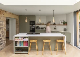
Another very common mistake is to make the core food preparation area too large. People are looking to create ever-grander kitchens these days and committing a great deal of space to them, which is great. However, in a larger kitchen it is vital to zone the space, keeping the distances between the principle elements (hob, fridge, sink, chopping area, dishwasher, oven etc.) down to a relative minimum. Kitchens where several paces have to be taken between key elements become cumbersome to use and will eventually just annoy the user.
Once the general layout and circulation has been established, you will find that many things that you might have agonised over will begin to fall into place. Kitchen islands are very popular features, for example, but they will not work in many instances. If you fall for one from the outset, you might try to shoe-horn it in to your design whether it is appropriate or not. The layout and circulation stage of your planning will uncover this, so that by the time you start choosing materials, surfaces, appliances and colours, you will know what fits naturally into the scheme of things. The important lesson here – whatever style choice you make – is to keep it simple.
Back to basics
Simplicity is a deceptive thing. Often the kitchens that appear the very simplest will have been the most difficult to design. But don’t mistake this for minimalism. You may long for a country-style kitchen with panelled door fronts, hanging utensils and lots of decoration, but no matter how visually busy the styling, the kitchen will only work well if the essential arrangement is simple and natural to the house.
When choosing materials, worktops in particular, it is vital to consider durability and clean-ability as well as colour and texture. Timber worktops, for example, have been very popular because they add a natural warmth to a kitchen and are relatively cheap, but many people are now tearing out their timber worktops, especially in areas around sinks as they find that they have not worn well, sometimes going black where water has been allowed to stand. Oak and soft or pale timbers such as beech and maple are particularly at fault here. It is not that timber is an inappropriate material for a kitchen worktop (I have a beautiful cherrywood one in my own kitchen, for example), but it requires very careful detailing and may not be the best choice around sinks and hobs.
Granite has been a firm favourite worktop material for high quality kitchens for years. It is very durable and clean-able, can be finished to a variety of surfaces from a highly polished shine to a rough hammered texture, is natural and is available in a remarkable variety of colours. Other stone choices such as slate can also be very effective and beautiful, but some – particularly the paler stones – require careful and regular sealing or they may stain.
Concrete is increasing in popularity and can be fantastic, particularly now that the technology has really advanced, or try resin/acrylic based materials, the best known being Corian, which can offer great functionality with a seamless surface and a variety of colours. However, many of these choices can be very expensive, so the roll-edged laminate worktop remains without doubt the most functional choice on a budget.
Key features
If you are looking to stretch your money, focusing your available budget on ‘flagship’ elements such as worktops, sinks, taps and extractors is a good idea. One recent project my practice completed involved a very basic choice of kitchen cabinets with simple white lacquered doors, chosen from the budget range of a large kitchen supplier, and the budget was saved for some beautiful, very thick Black American walnut worktops. These were specially made by a joinery company (despite the protestations of the kitchen supplier, which was dismayed to lose the sale of worktops from their order) and turned out quite beautifully.
This approach works only as long as the budget elements are good enough to hold their own functionally. I have seen a cheap kitchen on to which stainless steel door- and drawer-fronts were attached: it looked fantastic for a while, but the quality of the hinges, drawer runners and cabinets could not in the end cope with the weight of the doors. At first they started to mis-align regularly, but fairly soon they started to fall off – and that is not a good look!
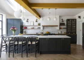
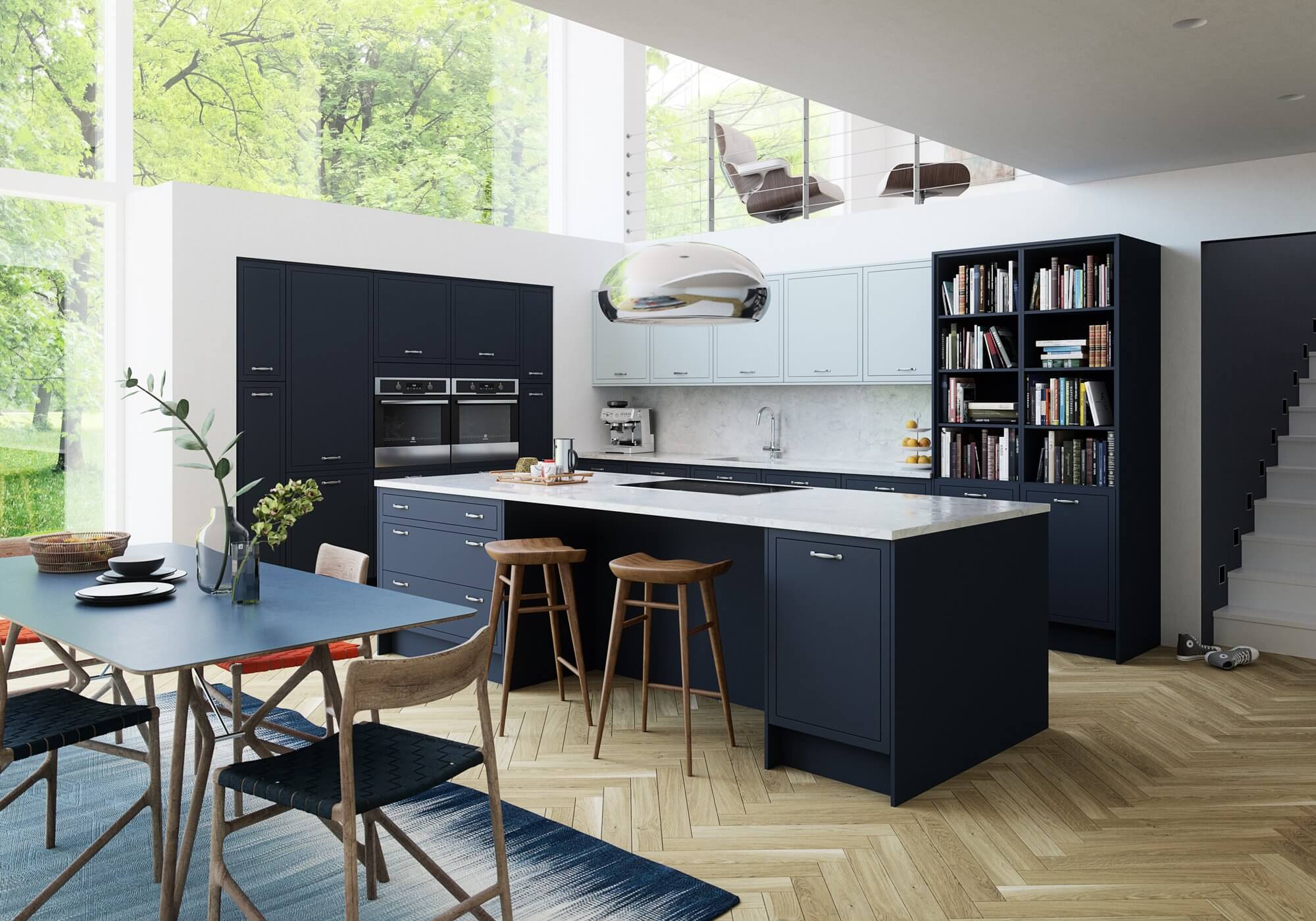
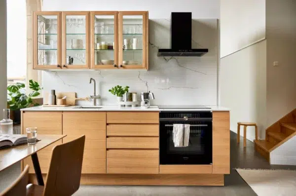
Main image: Magnet’s Newbury Midnight kitchen design features clean edges for a minimalist appeal. The dark colour looks striking alongside the duck-egg wall cabinets over the worktop
Hugo Tugman
You may be interested in


Comments are closed.